UX/UI Design
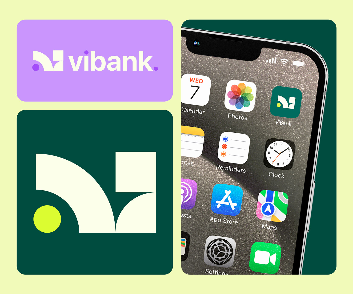
ViBank represents a new wave in digital banking, where usability and visual appeal are harmoniously balanced. The design process was driven by a commitment to responsive design and user-centred methodologies. From initial sketches to the final high-fidelity prototypes, I ensured that every element was optimised for clarity and ease of navigation. This project not only demonstrates my technical design skills but also reflects my ability to innovate within the constraints of a dynamic, user-focused environment.
In the ViBank project, my contribution involved developing a comprehensive UI that spans nine meticulously designed screens—including the accounts overview, current account, and my spending interfaces. Each screen was thoughtfully created to provide a seamless and engaging experience, utilising a design ethos that marries clarity with a touch of playfulness, all while maintaining a secure and trustworthy feel.


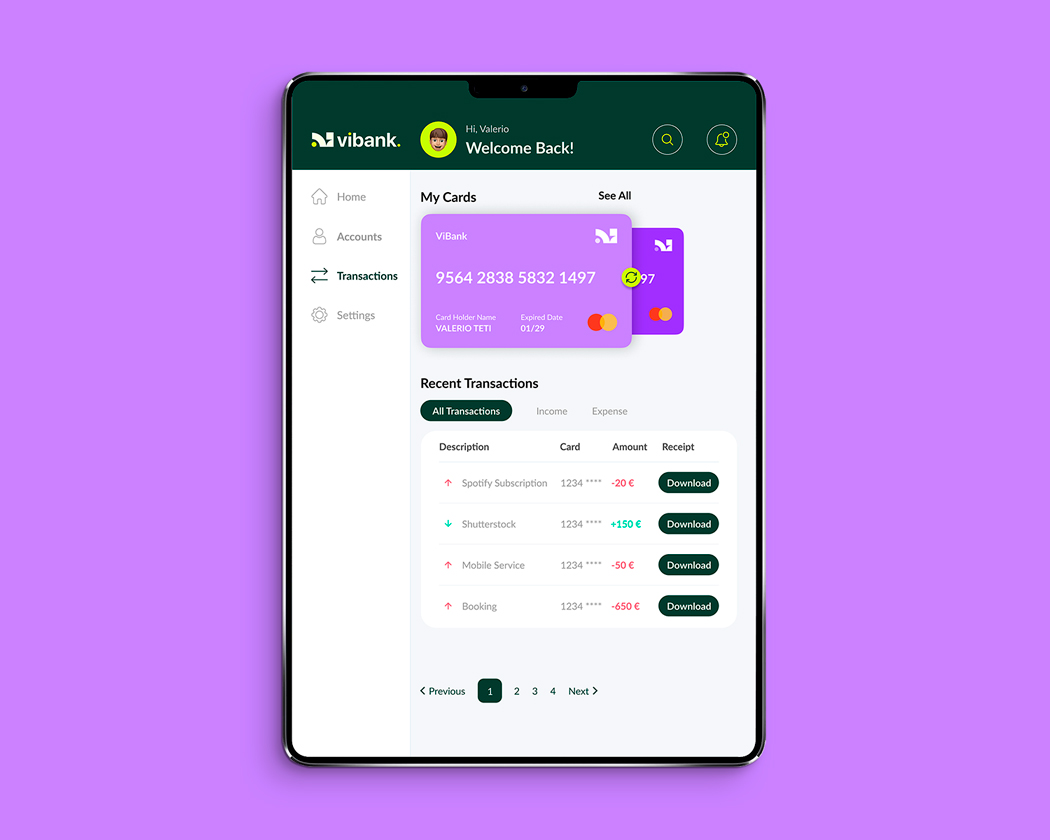


I am very pleased with how the accounts overview screen presents information. The design follows a logical hierarchy, making it easy for users to quickly grasp their financial status without feeling overwhelmed.
The responsive approach across desktop, tablet, and mobile maintained consistency. I ensured that key elements reflow elegantly, so users get a similar experience no matter the device.
By incorporating a mix of clear layouts, playful elements (like subtle colour accents and rounded shapes), and trustworthy details (such as secure iconography), the design effectively reflects the brand’s personality while ensuring usability.
The “My Spending” screen uses intuitive charts and graphs. I am happy with how the data is made accessible and engaging, supporting users in tracking their financial habits.
I would experiment with non-traditional grid structures and asymmetrical layouts, pushing beyond the standard information hierarchy. This might include more abstract placements of elements, even if it meant sacrificing some immediate clarity in favor of artistic expression.
Instead of sticking to a defined palette that reinforces trust and simplicity, I’d play with bold, unexpected color schemes and typography. The aim would be to evoke emotion and create a distinct visual identity even if it challenges conventional expectations for a banking interface.
I’d consider incorporating more elaborate animations and micro-interactions. These could transform the user experience into something immersive and narrative-driven, rather than strictly functional. The focus would shift from immediate usability to a more experiential, visually engaging journey.
With fewer constraints, I could experiment with elements that might be too risky in a traditional banking context, like artistic imagery or unconventional iconography. This could potentially create a memorable experience, but it would also require careful consideration to ensure that users can still navigate the app effectively.
Overall, without the clear, playful, and trustworthy guidelines, the design would lean more into creative experimentation and artistic expression, potentially sacrificing some user-friendliness for the sake of innovation and a standout visual impact.
Figma, Miro, Zoom, Adobe Photoshop, Adobe Illustrator
